
UX / UI
MOBILE APP
WEBSITE
AUGIE- A VIRTUAL CREDIT CARD APP FOR YOUTH AND IMMIGRANTS
DOMAIN
FINTECH
OVERVIEW
Augie is a US-based virtual credit card app startup that wanted a design overhaul for their MVP app to reach their intended audience and get seed funding. We conducted consumer research to create an easy and elegant product interface that encouraged youth and newcomers to build their credit score.
MY ROLE
Leading the design to ship the MVP from end-to-end
Liaison with clients and set the design language.
IMPACT
The MVP app gained $3 million dollars in the seed funding round for development.
PROJECT DURATION
1 month

PROBLEM STATEMENT
Augie's existing platform lacked appeal to their target audience and failed to provide seamless onboarding, hindering the conversion of users into recurring customers through reward points.
OUR APPROACH
With the product being in an MVP stage, we approached it as an Agile project. We split the MVP research and design in sprints and collected regular feedback from the client through collaborative show-and-tell sessions.
%20copy.jpg)
Discovery

Definition
Secondary Research

Solutioning
Conceptual Wireframes
Visual Design and Features

Completion and Learning
Information Architecture
DISCOVERY
Competitive Analysis and User Study
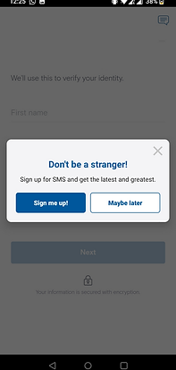


Image L-R: Image L-R: Koho’s onboarding drop off, Koho’s dashboard, Mission Lane’s dashboard

As an MVP, keeping the features upfront meant that users could easily navigate through the app.
INSIGHTS
After competitive analysis, we concluded:

The language needed to be simple and inviting as the 50% of users are 16+ years of age and almost 26.9 M people in US have limited English proficiency

A guided onboarding process with flexibility would give users the ability to complete the process in their own time.
DEFINING
Shaping the Concept
How does the product function? Journey map for MVP - Seamless flow
The app scrubs for subscriptions from the user’s bank activity and showcases them on the credit card. Once the user activates it, the money would get auto-debited from their bank account, regularizing their credit history.
Image: Journey Mapping for the first-time user

For the initial designs, I started by exploring UI patterns and created a conceptual flow with low-fidelity wireframes. This flow enabled me to understand the UI workflow. The client I worked with were very process-focused so I got visual feedback which I iterated upon further.

Visual Design
Design system and Style Guide
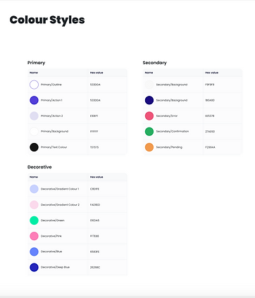
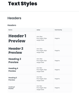
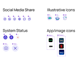
As I iterated on the design from the wireframe stage I first set up the style guide and Atomic Design System in terms of the color palette, typography, and icons. The main goal was to use high contrast and use a palette that can favor an interactive experience. I created a few screens using this design system and discussed it with the team before creating the designs.
See the Atomic Design System here.

Interaction Design
Interaction Design was an important aspect of making the user experience engaging and unique. We thoroughly iterated the animation and fixed on an interaction that was seamless yet interesting.
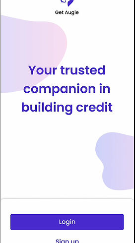
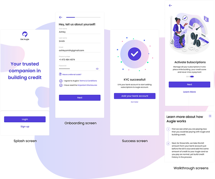
How might we create a seamless onboarding experience for the target audience?
-
KYC starts with personal details and a friendly and non-intrusive tone.
-
Success screens are designed to encourage users to move forward but give the flexibility to continue the journey later.
-
Guided onboarding through walkthrough screens that provide users with transparency to get an Augie Card.
How can the users access multiple features of the app?
Building on our wireframes, we were able to showcase the major features such as viewing card details, new subscriptions, upcoming payments, and previous transactions.
Users can easily see all their subscriptions as Manage Subscriptions under the icon or click on ‘see others’ next to New Subscriptions.


How might we keep engaging customers to come back to the app?
The Rewards and Referral system is a tool for gamifying user engagement with app.
Design Decision:
-
Show the credit score and reward points upfront to the users.
-
Visually prompt users to earn reward points with colours that pop.
-
Show status of rewards earned through icons for better recall.
-
Make the content for referral easy to be sent by existing and received by potential users.
SOLUTIONS
Lo-fi conceptual wireframes
COMPLETION AND LEARNING

-
Get feedback early
Clarify product requirements and discuss concepts before diving into key screen design.
-
Communicate in stakeholder-specific language
Simplifying certain design terms and using simple language when communicating with various team members in the project allowed me to articulate my ideas more effectively to each stakeholder.
-
Regulation and compliance
The user journey changed a little after the MVP app, supporting bank regulations and compliance- eg., the email verification was now done right after inputting email addresses instead of photo verification.
-
Next Steps
There were a bunch of features such as language preference, expense manager, goal setting, and financial literacy that would be in the next phase of the product past MVP.
Success Metrics
-
The product was successful in acquiring $3 million seed funding from investors in 2023.
-
It enabled the company to get approved by TCM Bank as a product partner
-
The platform will enable over 40 million US residents, mostly youth, minorities and immigrants, to create a credit profile and hence participate fully in the financial system.
Explore other projects


